

MERIL launches upgraded visualisation tool
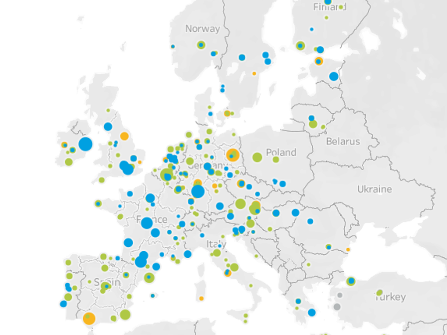
MERIL has relaunched its interactive visualisations tool with a fresh new look, featuring an improved dashboard interface and harmonious user experience. The upgraded tool can now be used in full screen mode, allowing users to explore the MERIL data more easily and visually access a whole range of information on European research infrastructures (RIs). The MERIL visualisation tool now includes four dashboards. Discover their new functionalities below: Interactive Map: With this tool, analyse the geographical landscape of RIs across Europe and its worldwide reach. A whole range of improved filters have been developed to facilitate this exploration. Bubble Plots: Complementing the previous geographic analysis, the bubble plots provide further data on RIs’ scientific domains and a brand-new word cloud illustrates the most frequently used RI categories. RIs Status: This dashboard provides insights into the completion status of RI entries in MERIL for any given country. The filters allow you to monitor RI development trends and observe roadmapping processes – which is particularly relevant for policy makers. An additional feature, the heat map, assists users in tracing these trends for each country in relation to the scientific domains. RI Users & Access: The last dashboard offers more information on who accesses RIs and how. In some select cases, it is also possible to track the user’s demographics. After exploring the different dashboards, users can download the generated visualisations and share their findings with their network. Explore the visualisation tool: http://visualisations.meril.eu/(opens in new window)